Google's Satellite Map Gets a 700-Trillion-Pixel Makeover
It’s the cloudless map’s biggest update since 2013.
More than 1 billion people use Google Maps every month, making it possibly the most popular atlas ever created. On Monday, it gets a makeover, and its many users will see something different when they examine the planet’s forests, fields, seas, and cities.
Google has added nearly 1.5 trillion pixels of new data to its service*. The new map, which activates this week for all users of Google Maps and Google Earth, consists of orbital imagery that is newer, more detailed, and of higher contrast than the previous version.
Most importantly, this new map contains fewer clouds than before—only the second time Google has unveiled a “cloudless” map. Google had not updated its low- and medium-resolution satellite map in three years.
The improvements can be seen in the new map’s depiction of Christmas Island. Almost a thousand miles from Australia, the island was largely untouched by human settlement until the past two centuries. Its remoteness gives it a unique ecology, but—given its location in the middle of the tropical Indian Ocean—it is frequently obscured by clouds. The new map clears these away:
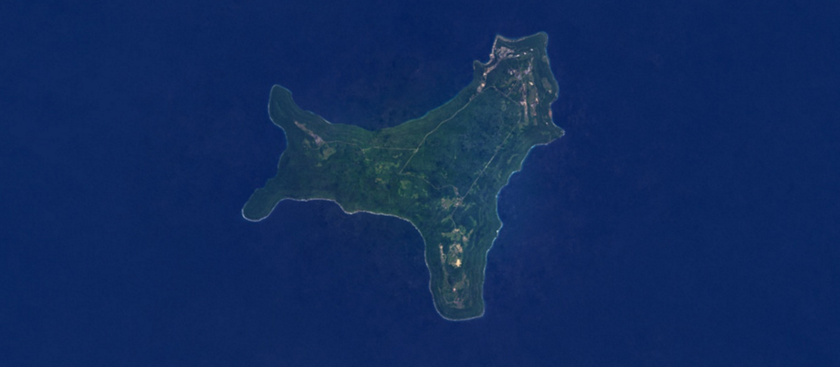
A 99-acre immigration detention center operated on behalf of the Australian government can now be clearly seen; it’s the only tan splotch of development in the island’s northwestern “arm.” In the old version of the map, the detention center was harder to distinguish from clouds. The island’s eastern settlements are also now completely visible. Compare the old version of the map:
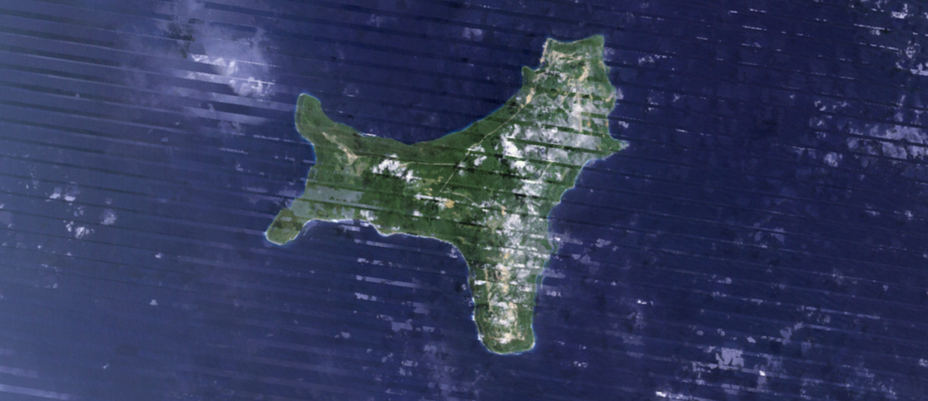
The new map also does not include the darker diagonal lines that seem to slice across the older scene above. These lines were caused by a physical malfunction on Landsat 7, the U.S. government satellite which supplied the older map’s imagery data. The new version of the map includes data from Landsat 8, the newer version of the same satellite, letting Google clear the ugly artifacts.
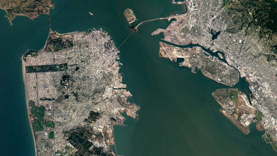
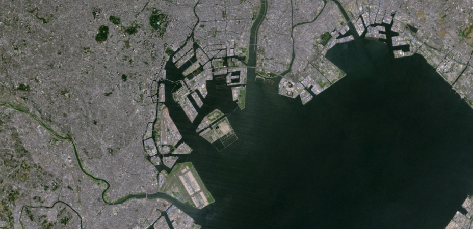
Landsat 8 has been operational since the spring of 2013. Its inclusion helps the new map contain newer data—and, thus, newer structures. In the new map’s version of Toyko, the “D” runway of Haneda Airport can be seen in the bottom center of the frame. The standalone runway was built on reclaimed land in 2010.
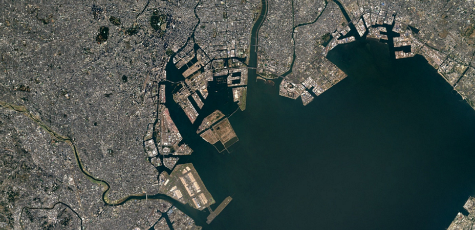
In the older version of the same scene, the D runway seems more translucent. The map overall is also blurrier, less saturated, and more generically gray.
This “ghostly” runway effect points to how Google makes its maps cloudless in the first place. Neither of the images above were captured on a single shoot by a solitary satellite, the way that a camera might capture a snapshot. Instead, Google engineers used a recently developed cartography technique called mosaicking.
Mosaicking draws upon the vast archives of imagery that have been created by the U.S. government’s Landsat program, a series of satellites that have photographed the Earth’s surface every 16 days since the 1970s. (Landsat 7 and Landsat 8 are only the most recent of these craft.)
Taken individually, most of these pictures captured by the Landsat sensors include some clouds. This makes sense: About 70 percent of Earth’s land surface is covered by clouds every day. Over time, though, very few places are completely obscured by clouds. Mosaicking joins the cloudless parts together through the power of surprising, elegant math.
A mosaicking algorithm inspects each pixel of imagery individually—across all of the images of that particular pixel collected by Landsat 7 and 8. (If the archive is properly calibrated, that one pixel should describe the same spot of Earth no matter when it was taken.) In essence, the algorithm takes an initial average color value for that pixel over time. Then it drops the images that are much lighter than that average—since they likely include clouds—and averages the most recent set of remaining, now-cloudless photos to find a final color value.
Then it runs that program for the next pixel. Eventually, these “best pixels” are stitched together into a single map—a mosaic. The team analyzed more than 700 trillion pixels of satellite data in the entire mosaicking process.
Google’s version of this algorithm factors in other special circumstances, like seasonal effects. Matt Hancher, an engineer, called the process a “glorified computation of the median.” The company’s Maps and Earth team has used a mosaicking algorithm to generate its satellite map since June 2013.
An odd characteristic of the mosaicking process is that it captures the essential character of what a place looks like even though it actually encompasses years of data. When writing about a mosaicked map of the United Kingdom produced by the startup Mapbox in May 2013, the journalist Tim Maly wrote: “At no point in the history of the United Kingdom has it looked like this [map]. Yet this [map] is exactly what it looks like.”
Mosaicking is computing-intensive: It has only flourished in the past three years due to industry-wide improvements in cloud infrastructure. Google’s new satellite map ultimately gobbled up more than a petabyte of imagery data. It took more than six million hours of computation to do, a feat of processing that about 43,000 computers in Google’s cloud infrastructure managed in less than a week.
Google’s new update doesn’t include imagery at the highest zoom levels, like the kind needed to closely inspect an individual house, pool, or baseball field. Those pictures do not come from Landsat at all, but from a mix of other public and private aerial and space-based cameras, including DigitalGlobe’s high-resolution satellites. This update only covers zoom levels zero through 12.
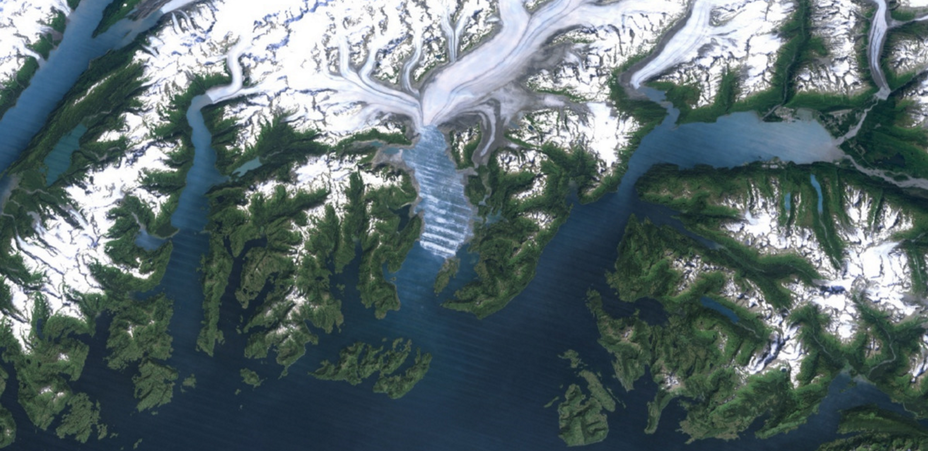
Yet the new map still reveals a surprising amount of land change. Compare these images of Columbia Glacier, an ice floe on the southern coast of Alaska near Valdez. The first is from the 2013 version of Google’s cloudless map, and the glacier is visible despite the diagonal marring of Landsat 7:
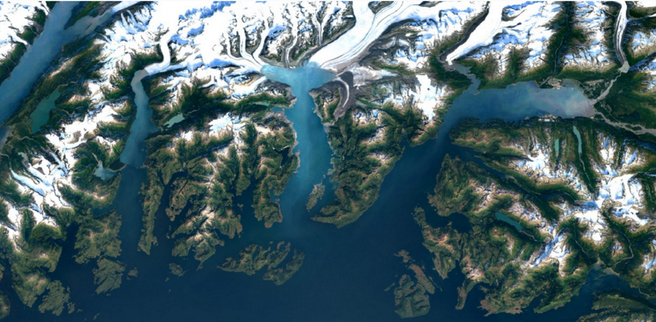
In the newer version of the map, the diagonal scarring is gone—but the glacier has also clearly receded farther inland:
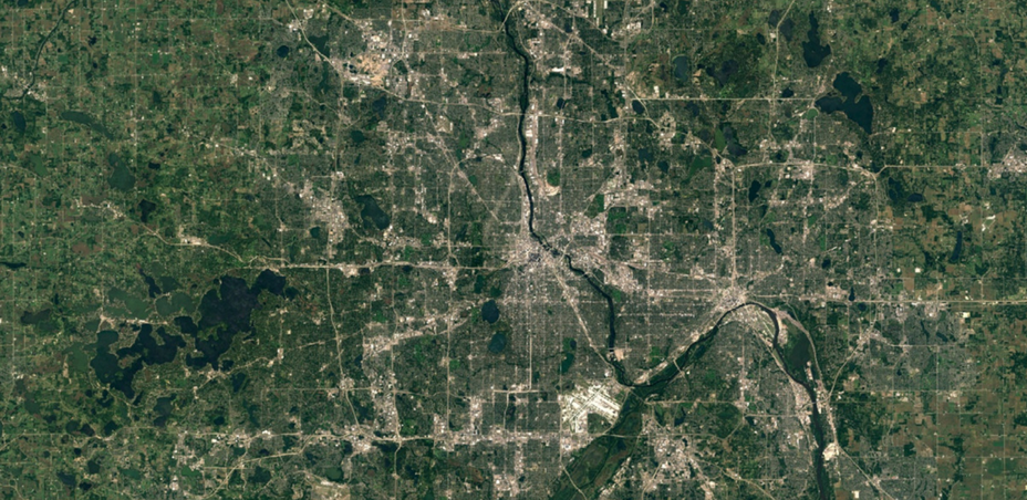
The new map’s recentness reveals more than the changing climate. Compare these two images of Minneapolis. The first is from the 2013 version of the cloudless map.
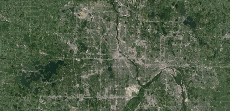
The new version of the map is less green—the highway tans stand out more, and the lakes are a darker navy. But the new map also reveals a long smear of a scar in the city’s northern core, left over by the city’s deadly tornado in 2011.
Here is that section magnified, with the scar highlighted:

The image processing for this most recent map was completed entirely in Google Earth Engine, the company’s geospatial-focused cloud infrastructure. In fact, the entire algorithm to create the cloudless map was written in Javascript in the Earth Engine development interface. The same interface has also been used to compute forestry research and predict malaria updates.
And, in some ways, Google Earth Engine is what is ultimately the focus here. Earth-based cloud computation is expected to be more and more important for financial trading and corporate investment. Improving Earth Engine is part of why Google purchased Terra Bella, a satellite company, two years ago. For big tech companies, how something got on the map is soon to be as important as what’s there in the first place.
* This post originally stated that Google added 700 trillion pixels of data to its satellite map layer. In fact, it analyzed 700 trillion pixels of data to create a 1.5-trillion-pixel final product. We regret the error.